
BrightBegin
Mobile app focusing on gamification for 3-5 y/o kids and data monitoring for parents
I conducted user analysis, designed wireframes, created a brand identity, and visualized user flows. I focused on addressing parental concerns with data analysis features and developed a reward system for kids.
DURATION: Mar 2024 - Aug 2024
ROLE: Product designer, Illustrator
TOOLS: Figma, Illustrator, Miro
TEAM: Founder and Resercher
USER: 3-5 y/o kids and parents
RESULT: Design solutions that played a pivotal role in securing $170K in investor funding.

Kids cry and parents give them a phone for distraction, leading to prolonged, unsupervised watching of random videos.
How can we solve this?

Our solution: BrightBegin
Key features
Educational content
Reward system for kids
Data monitoring for parents
Who is it for?
3-5 y/o kids and their parents
How It Solves the Problem
Turns screen time into an opportunity for learning and growth in a controlled environment

The founder approached me with this project
Founder’s initial ask:
Make it pretty.
Yes, but there is more that we can achieve.
New UX Strategy!
Founder’s initial wireframe →
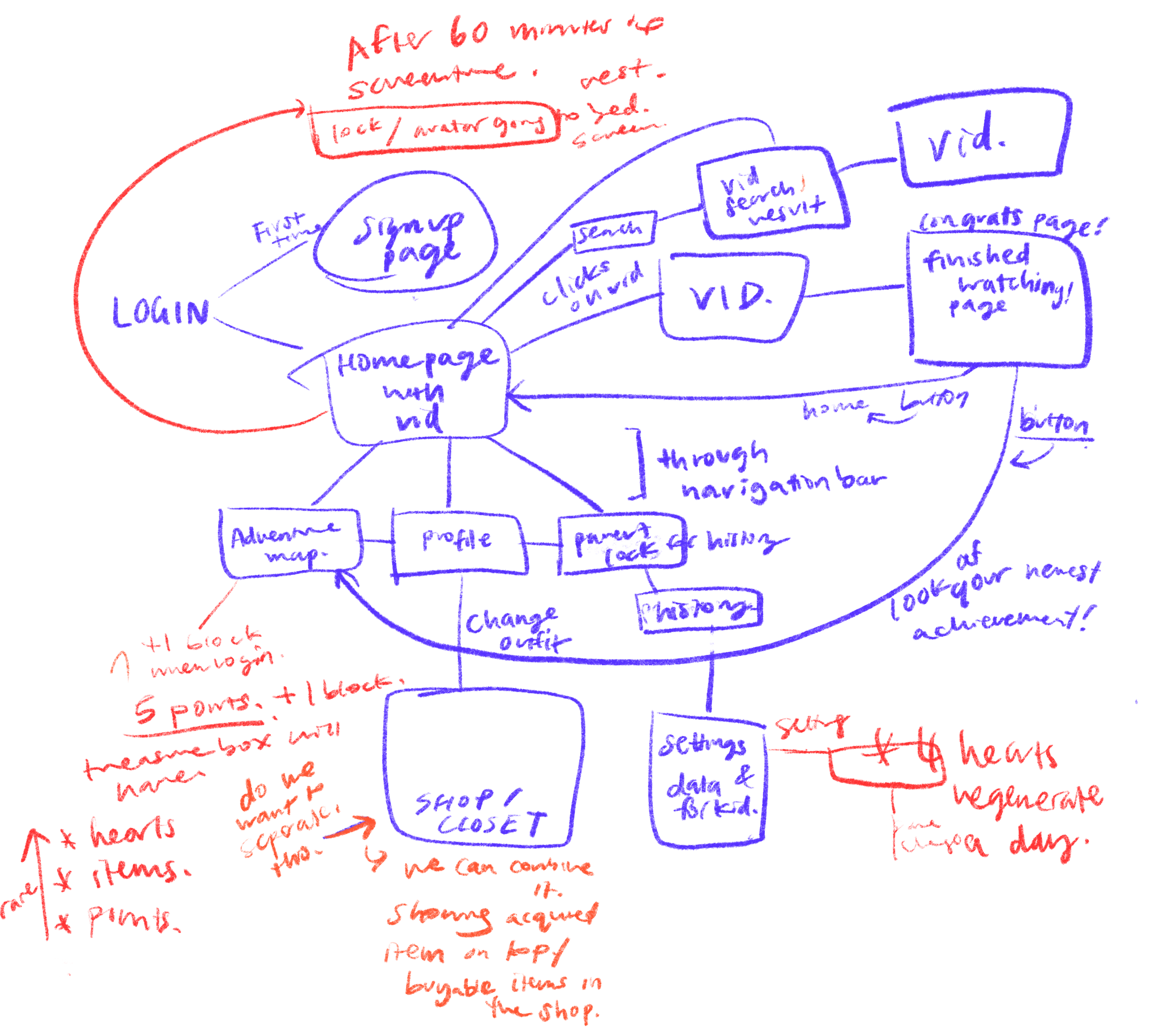
To begin, I sketched out an information architecture map, I realized with all the info:
I proposed having separate app sections to create a tailored experience for kids and parents.
Here is an overview:

User group I: Designing for parents.
What do parents want?
-
“ I sometimes check what content he watches, but I cannot track all the content he does.”
-
"If I can check the graph or data of kids on Mypage for parents, I want to use the data for which primary school to choose, which location to live in, and which sports or hobbies to join.“
-
“I do not know what content she watches, but I do not want her to be addicted to YouTube”
Insights from 30+ parents’ interviews:

How did we address their wants?
Parental control is not new to the market, so we wanted to direct most of our energy to:
Data Analysis
Validating: Approximately 73% of the participants expressed their interest in their kids’ data

Making data easy to find
Final Wireframe
Initial Wireframe
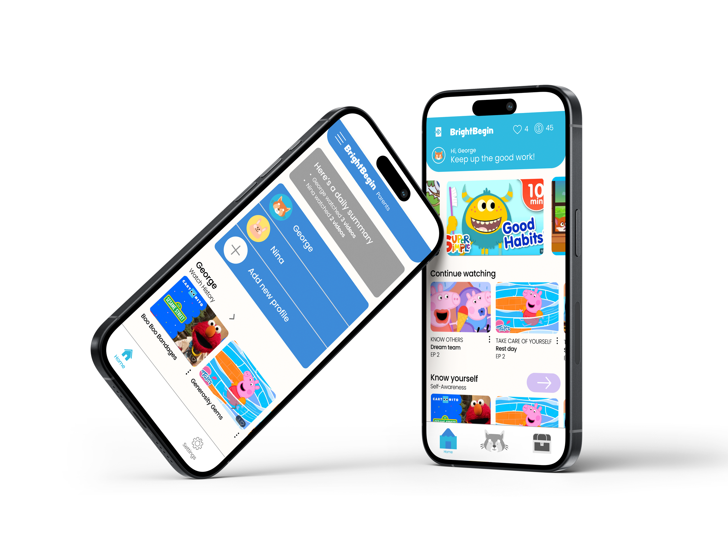
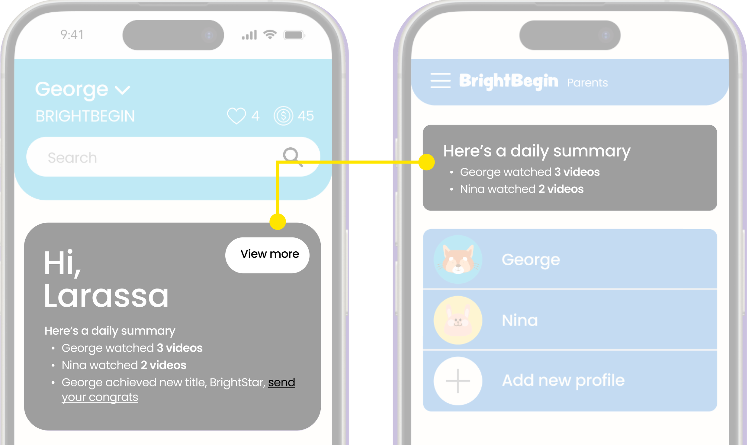
Instant Summary
Easy to digest information
Iteration:
User Insight: Parents found the content wordy and unnecessary
Design Change: Replace lengthy text with a concise summary.
Initial Wireframe
Final Wireframe
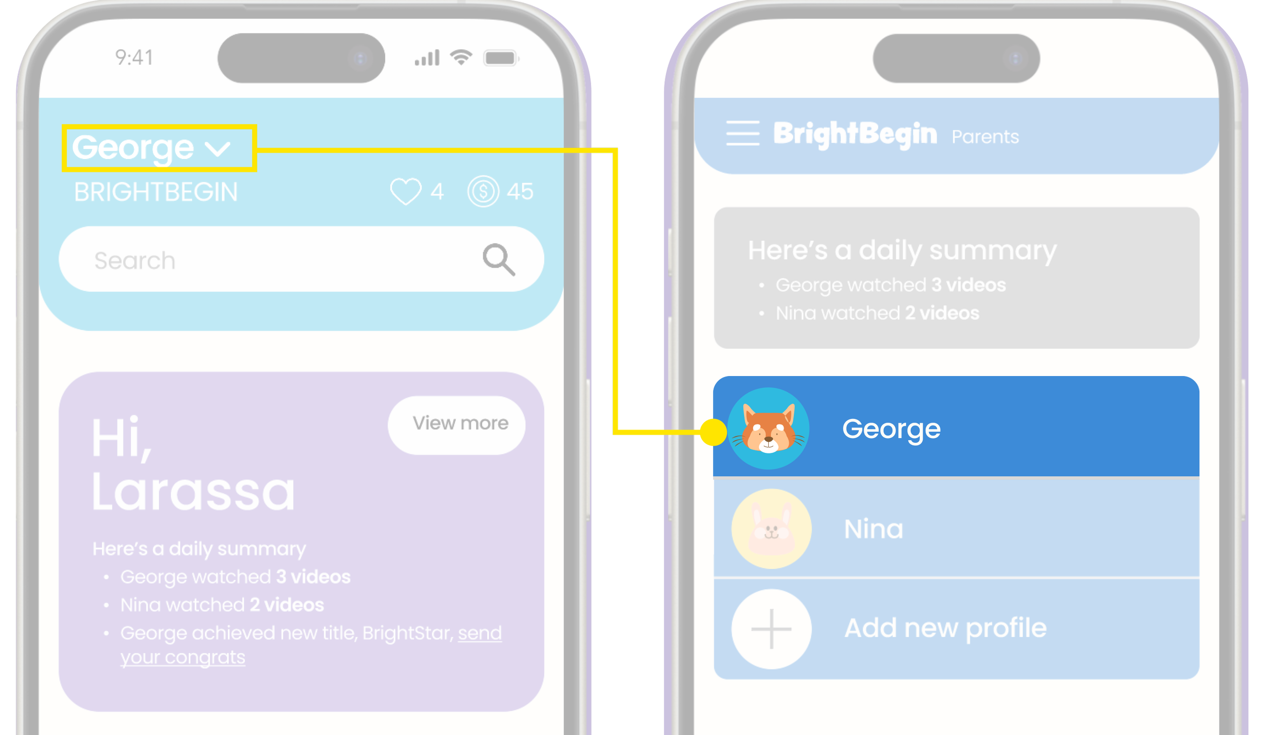
Quick link to data
One-click to data analysis.
Iteration:
User Insight: “How do I see Nina’s profile?”
Design Change: Users were confused about switching profiles. We made it easier for users to identify the current profile by placing it front and center.

User group II: Designing for 3-5 y/o kids
What do kids want and need?
According to parent interviews and external research:
WANT
A gamified experience
Watch fun videos
NEED
Have a screen time limit
Simplified System
Creating engaging, reward-based systems to motivate progress.
We need the right incentives to “help encourage child’s good behaviors and increase self-esteem (CDC.)”
How did we address kids wants and needs?
Gamification
Promotes Learning through Play for 3-5 year olds
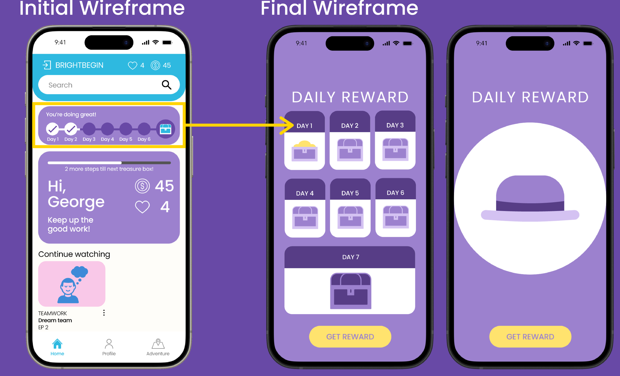
Daily sign-ins
Incentive to get kids excited to learn
Iteration:
User Insight: Kids frequently click on things and overlook items placed at the top.
Design Change: Made rewards bigger and more prominent to capture attention.
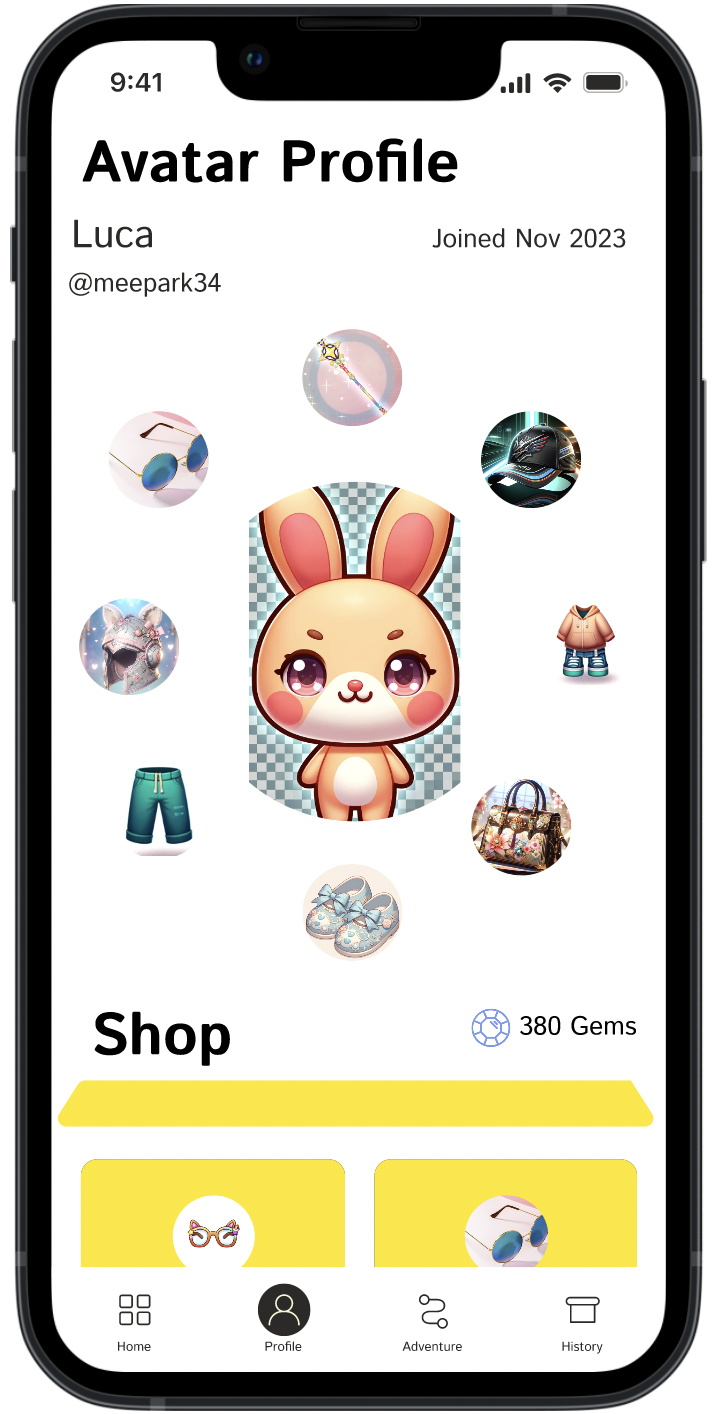
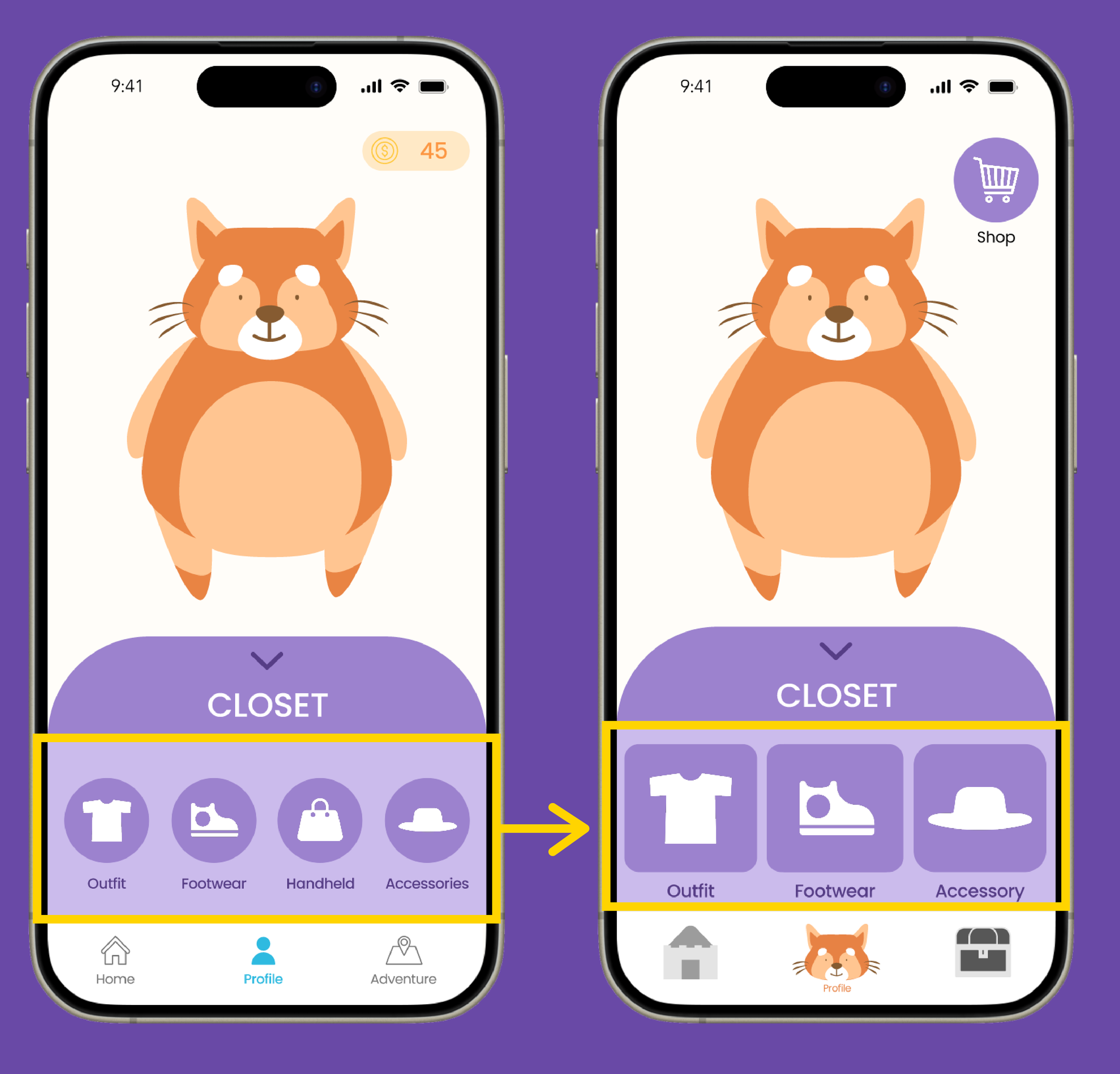
Buying items with coins
Personalization & Immediate Gratification
Providing kids with the incentive to complete quizzes and continue watching videos
Iteration:
User Insight: Kids frequently misclick and don’t understand the 4 categories
Design Change: Made the buttons bigger and reduced the amount of choices
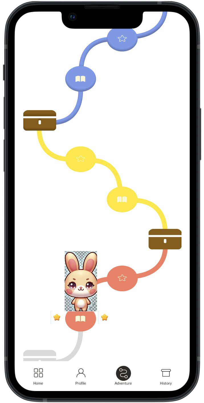
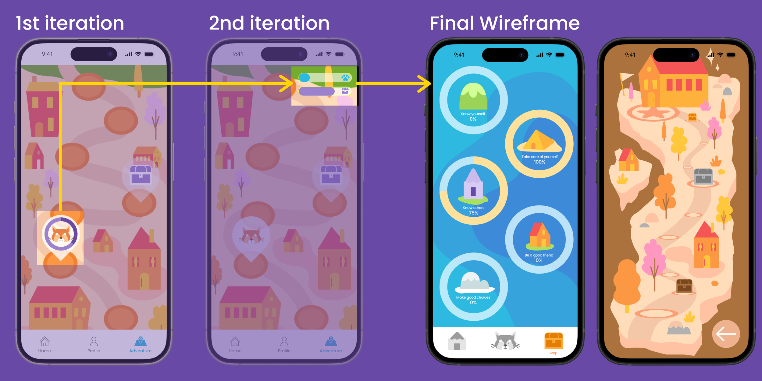
Adventure map
Visually represents progress
Map Progression: Clear path to the finish encourages kids to reach the end.
Hidden Achievements: Unlock surprises as kids advance on the map.
Stage Rewards: Different areas offer themed rewards in the treasure box.
Iteration:
User Insight: Circular progress bar, but it didn’t show how close kids were to the treasure box/ The dual progress bar was too much information and kids did not care.
Design Change: Reduced the map to separate categories to show their progression in specific areas.

Screen Time
Mitigate crying or tantrums: “When I stop her to watch them (videos), she sometimes cries or gets upset, so it’s hard to stop her.”
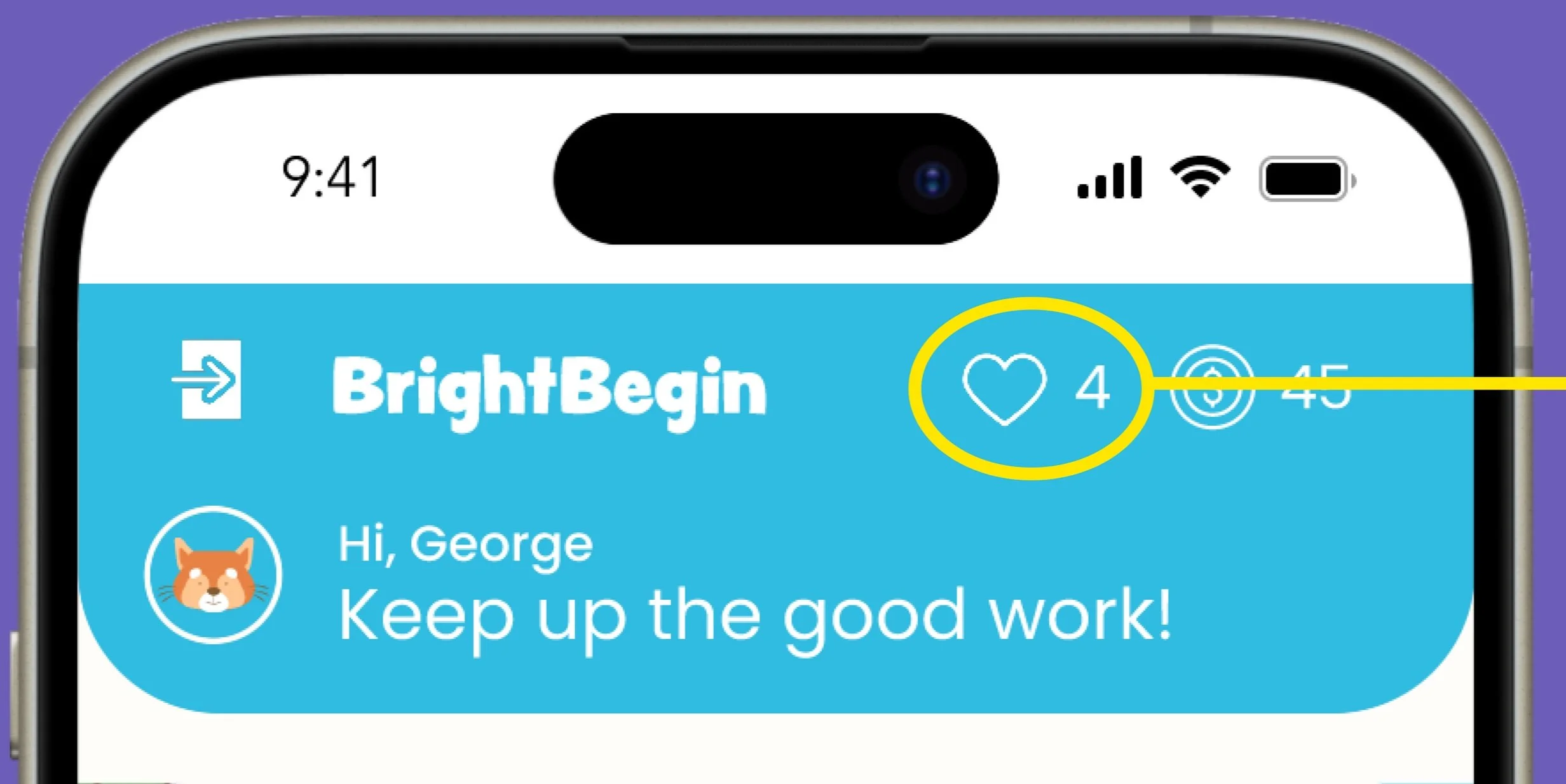
Time limit: A Heart system
Daily Limit: 5 hearts generated daily.
Heart Costs: Videos cost hearts, capping watch time at 60 minutes/day.
Clear Expectations: Kids know how many videos they can watch
Watch Time Guidelines: Keeping screen limit < 1 hr
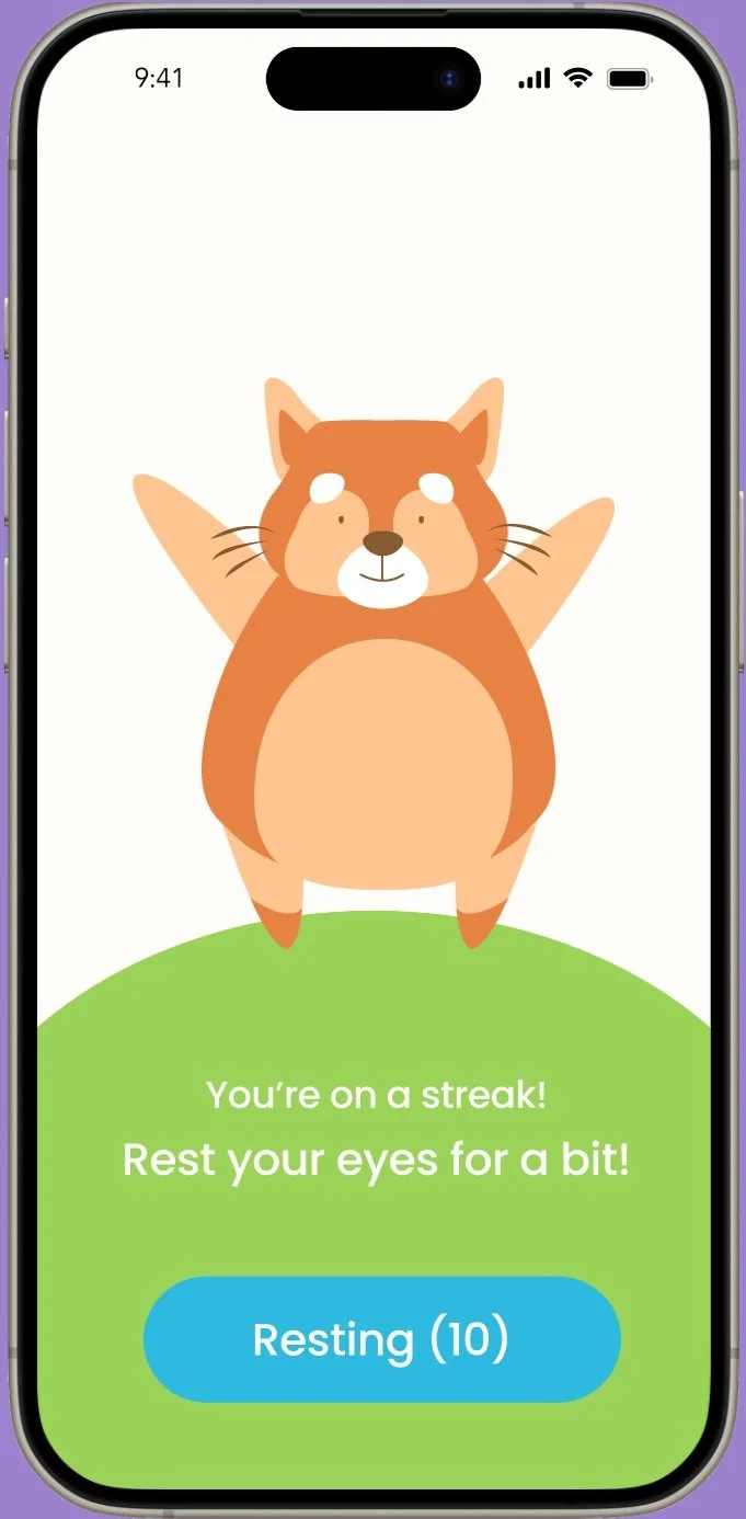
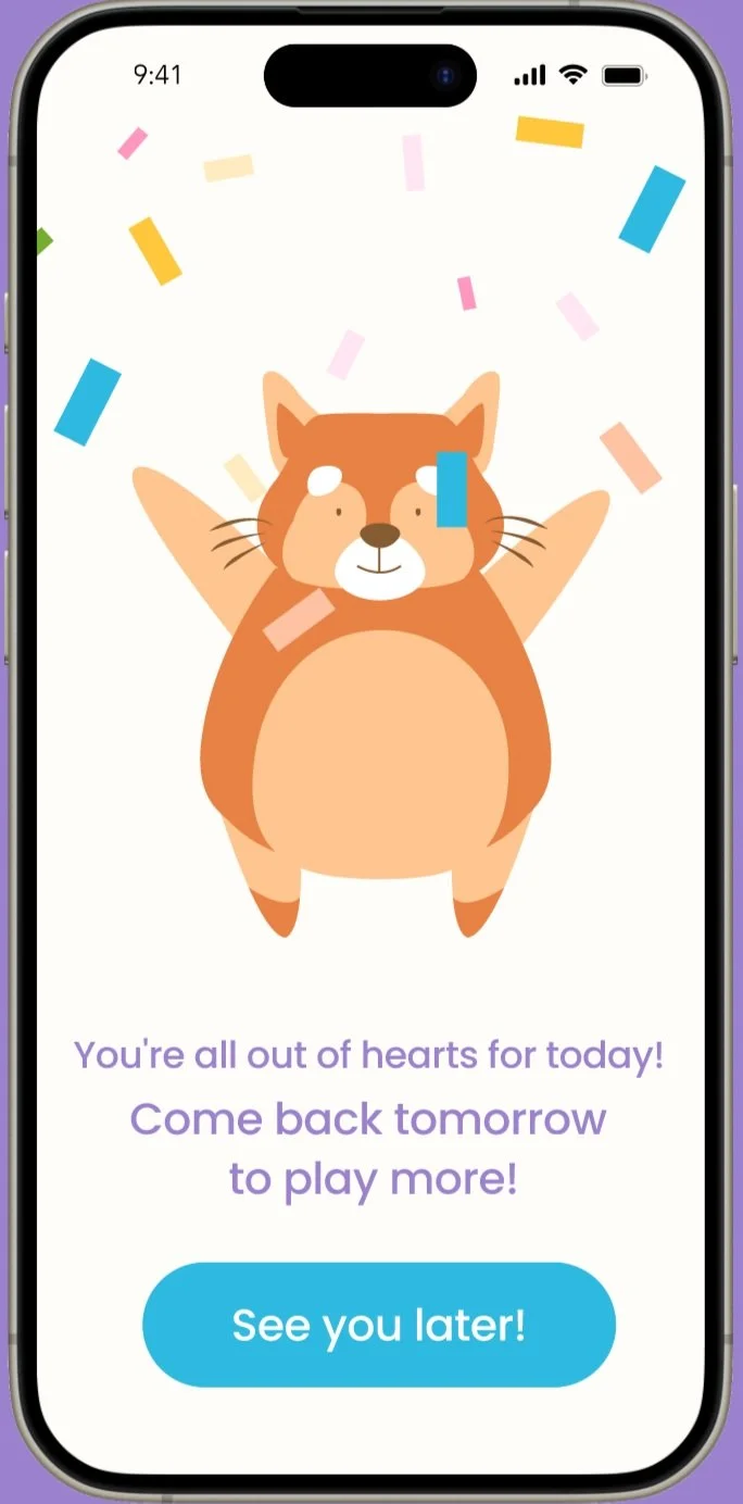
Providing an end experience
Positive Closure: associate screen time limits with a positive experience such as celebrating.
Reduces Resistance: Friendly end prompts reduce tantrums when time is up.


If you want to click around:

This design solution played a pivotal role in securing $170K in investor funding.
Reflection
What I learned:
Take the initiative and propose what you believe as a product designer
Communicating through research and data points is effective in translating my design decisions
User testing is so powerful. Especially when working with children, loads of surprises and insights!
Recommendations to the founder:
Conduct usability testing with 3-5 year olds
Gather parents' feedback on the prototype
Get engineers' feedback on prototype feasibility and discuss design implementation
How I would measure success:
Approval from Parents
Kids can navigate through the app easily
Successful implementation
