Sutra.ai
Sutra.ai is an AI start-up transformation platform designed for Business Builder. Its SaaS solution offers flexible deployment options, empowering businesses to drive innovation and efficiency with scalable, on-demand access to advanced AI technologies.
During my internship as a Product Designer at Sutra.ai, I developed a zero-to-one model for opportunity.ai, empowering business users to identify potential market gaps with ease and efficiency. Additionally, I designed an onboarding experience to transition users from the legacy model to the latest platform, reducing the need for operational support.
ROLE: UX intern
TEAM: Engineers, Product Designer, Business Analyst
DURATION: 3 Months (Jun 2024 - Aug 2024)
TOOLS: Figma, XD, Miro
OUTCOME:
Implemented by Engineers and now live on Sutra.ai ↗
Opportunity.ai Project Kickoff:
The CEO introduced a tool developed by the engineering team—Opportunity.AI
It is designed to identify potential areas for business improvement for mid-market decision-makers with limited technical expertise, enabling them to identify and act on critical business improvement opportunities.
The absence of this tool would mean a gap in accessible, data-driven insights tailored to their needs, potentially leaving business owners at a competitive disadvantage in their market.
Problem:
The interface had to simplify complex AI outputs, ensuring decision-makers with limited technical expertise could easily understand and act on the recommendations without feeling overwhelmed.
Solution
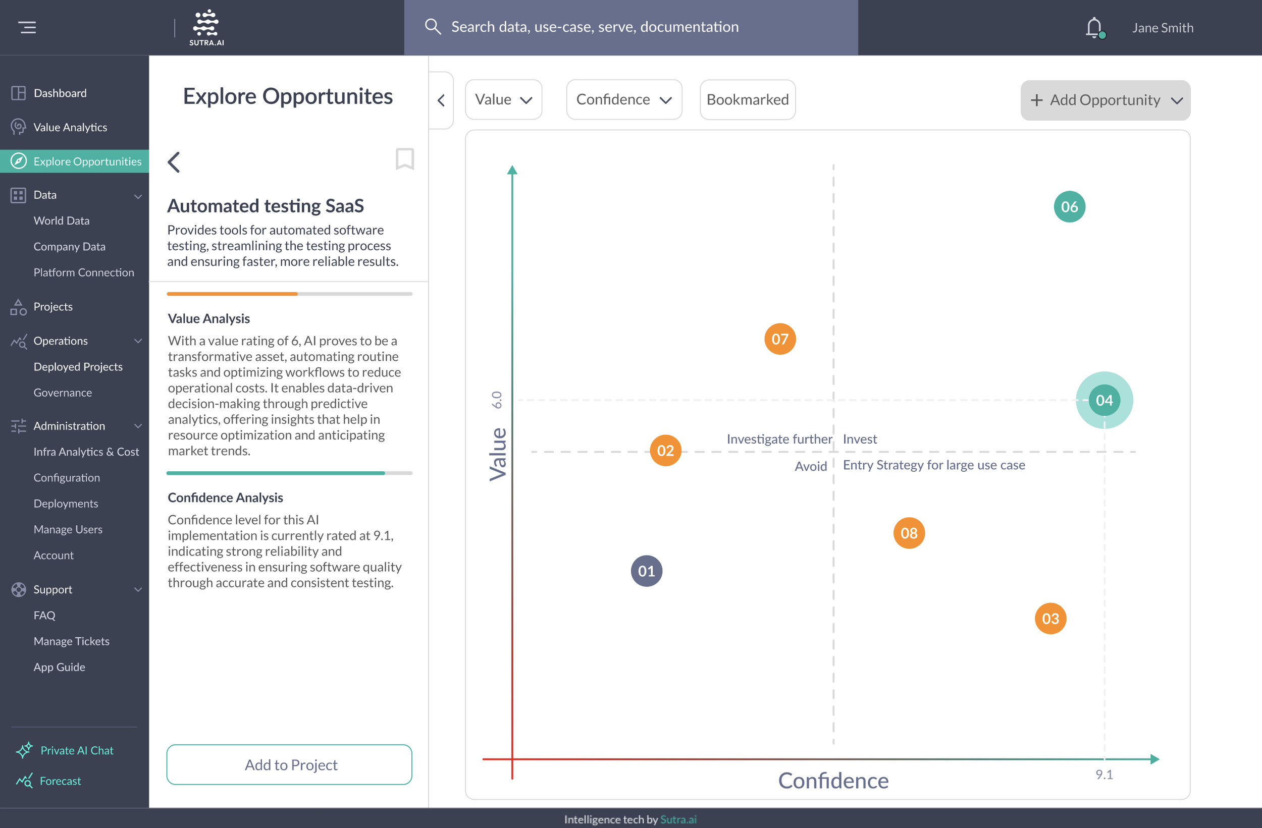
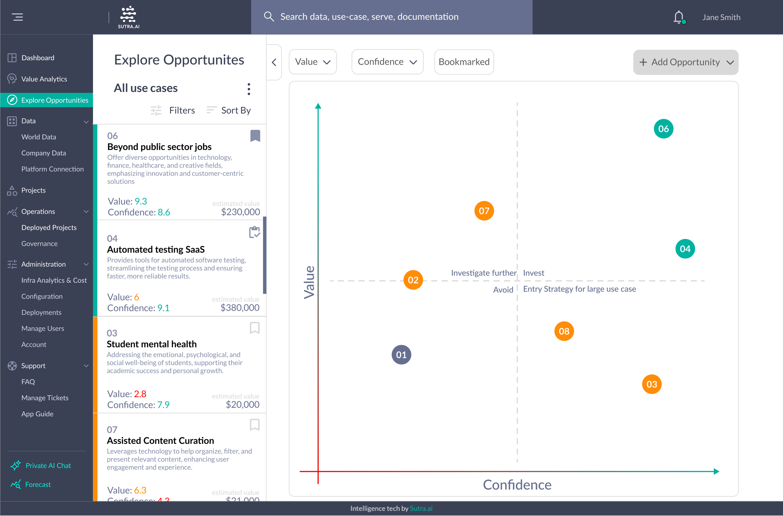
This Opportunity.ai screenshot highlights AI-suggested next steps for business users, confidence level of the prediction, and the potential value of implementing the tool. If you want to learn more about the product↗
I built the opportunity.ai interface from zero to one, leveraging existing user insights, understanding of current users, predictions of their behavior, iterative design, and competitive analysis.
Simplified Interface Design:
I focused on designing a clean, intuitive layout that visually prioritized the AI's predictions, confidence levels, and suggested next steps.Clear Data Presentation:
To make the tool accessible, I used familiar design patterns like progress indicators, tooltips, and categorized suggestions, reducing the cognitive load for non-technical users.Seamless Integration:
I ensured the design aligned with the platform's existing visual and functional elements, making it feel like a natural extension of the system.
Before designing, the challenges I was facing
Resource Constraints: Limited user data and no existing research team, relying on a basic understanding of how users interact with the platform to infer insights for a completely new system.
Starting from Scratch: Building a new system from the ground up with no prior framework or data points.
Short Timeline: Completing the project within just four weeks before the end of my internship.
Understanding potential users
To combat the challenge of limited resources & starting from scratch…
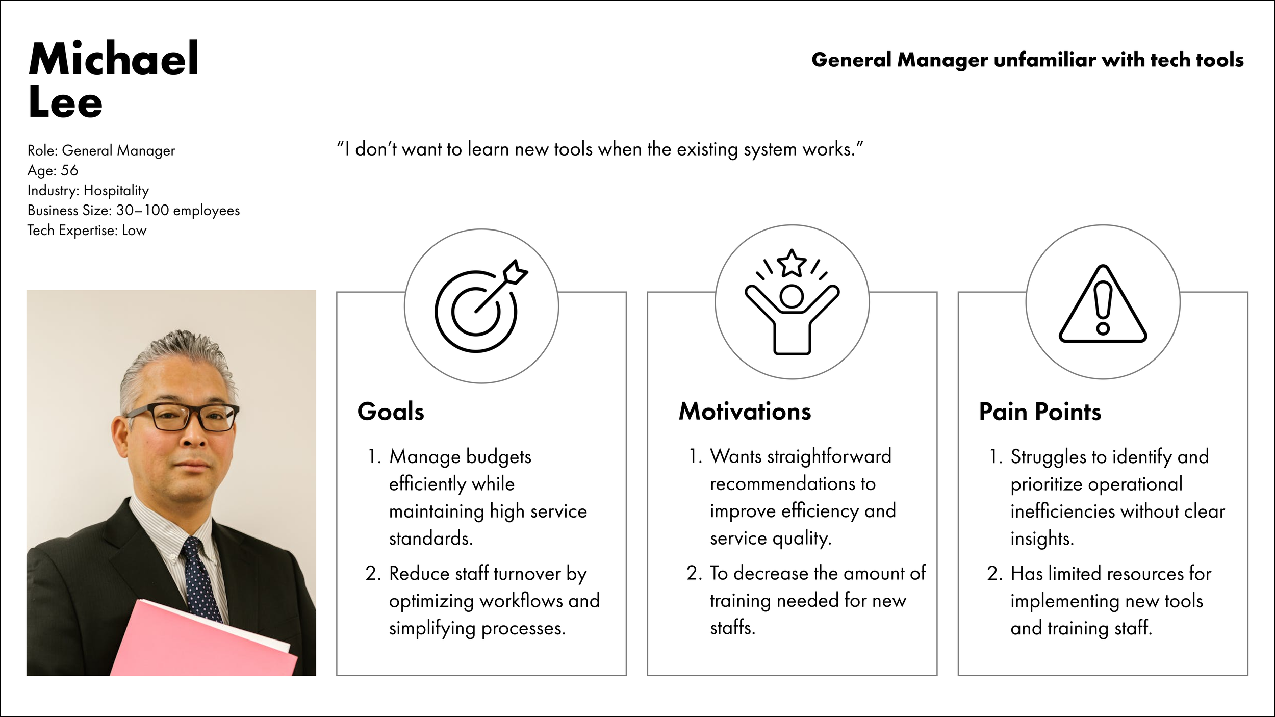
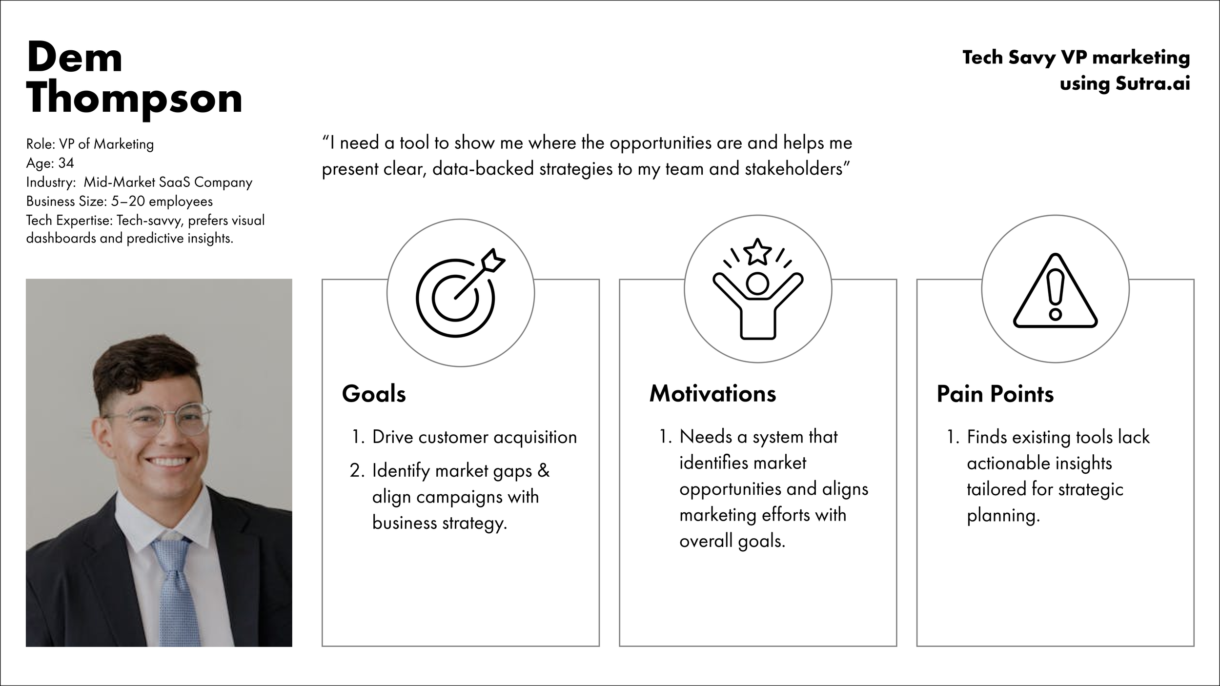
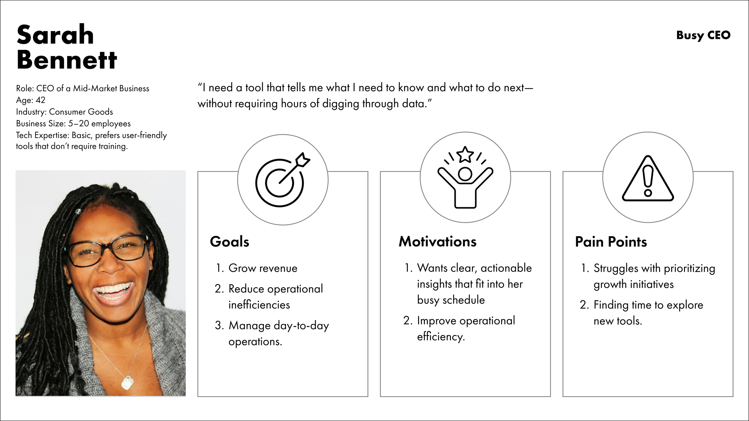
Created user personas, based on existing research that Sutra had on their consumer, to better understand pain points and needs.
How did the user personas inform my design decision?
-
Insight: Business owners want quick, actionable insights without complex analysis.
Design Translation: Used value and confidence metrics with clear, color-coded priorities (grey, orange, green) to make evaluating opportunities fast and intuitive.
-
Insight: Users want to explore options without committing immediately.
Design Translation: Added a bookmark feature like a shopping cart, allowing users to save opportunities for later comparison.
-
Insight: Users need a clear way to track deployed projects alongside new opportunities.
Design Translation: Included a deployed status to distinguish between active and potential projects for better planning and transparency.
-
Insight: Business owners value clarity and simplicity in navigating data.
Design Translation: Created a user-friendly layout that prioritized color coding, descriptions, and metrics, reducing the need to read through detailed data.
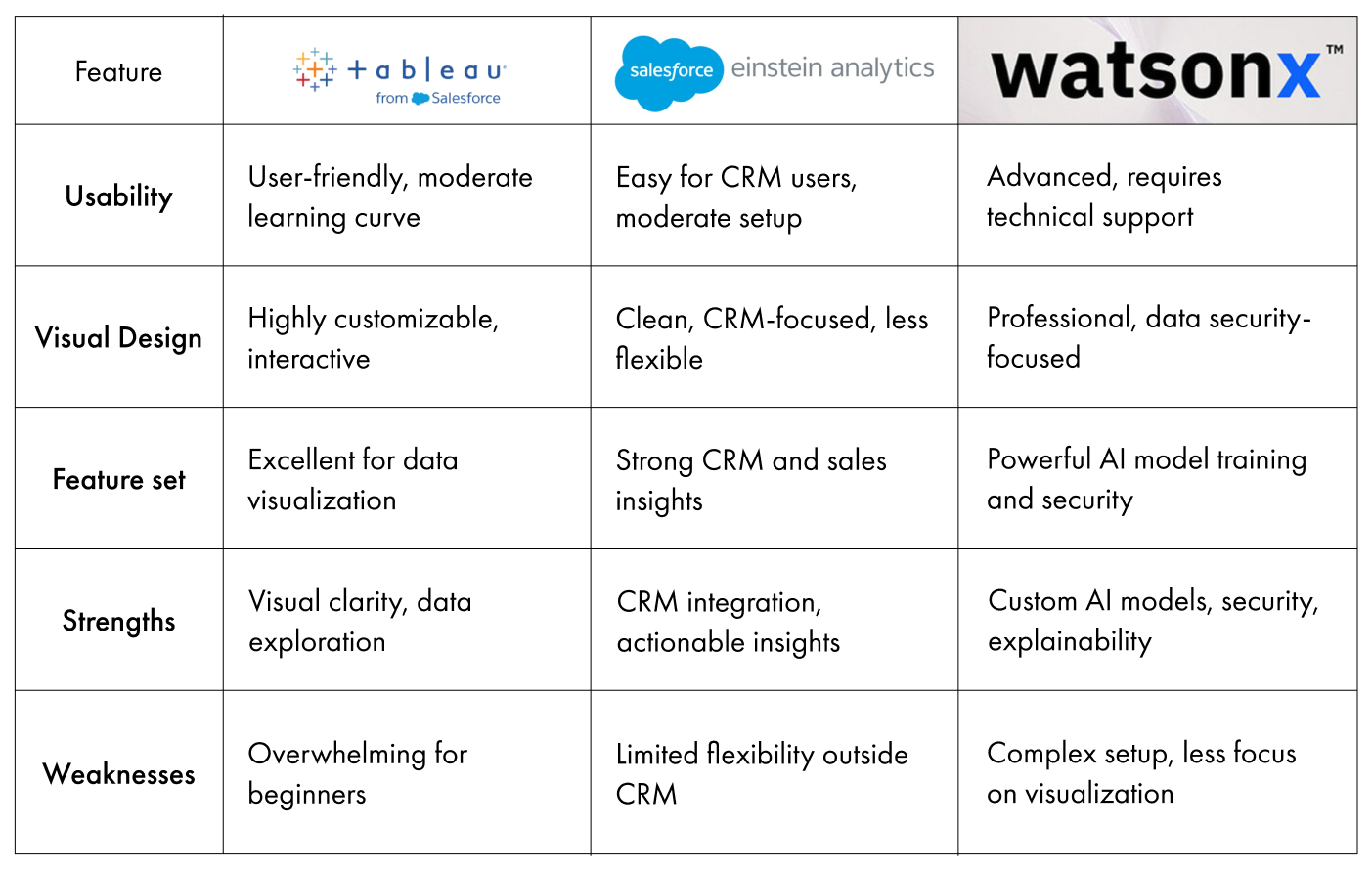
Competitive Analysis on similar AI tools
Providing insights into industry standards, user expectations, and design opportunities.
-
Pro
Intuitive Dashboard
Customization Options
Seamless Integration with IBM Tools here
Con
Steep Learning Curve
Built for Engineers
Overwhelming Complexity
-
Pro
Recommendations for business opportunities
User-friendly dashboard
Con
CRM-related insights
-
Pro
Highly visual and accessible for non-technical users
Integrate with data sources to provide actionable insights
Con
Requires some understanding of data visualization principles
Not specifically tailored to strategic road mapping for business transformation.
Based on research,
Insights:
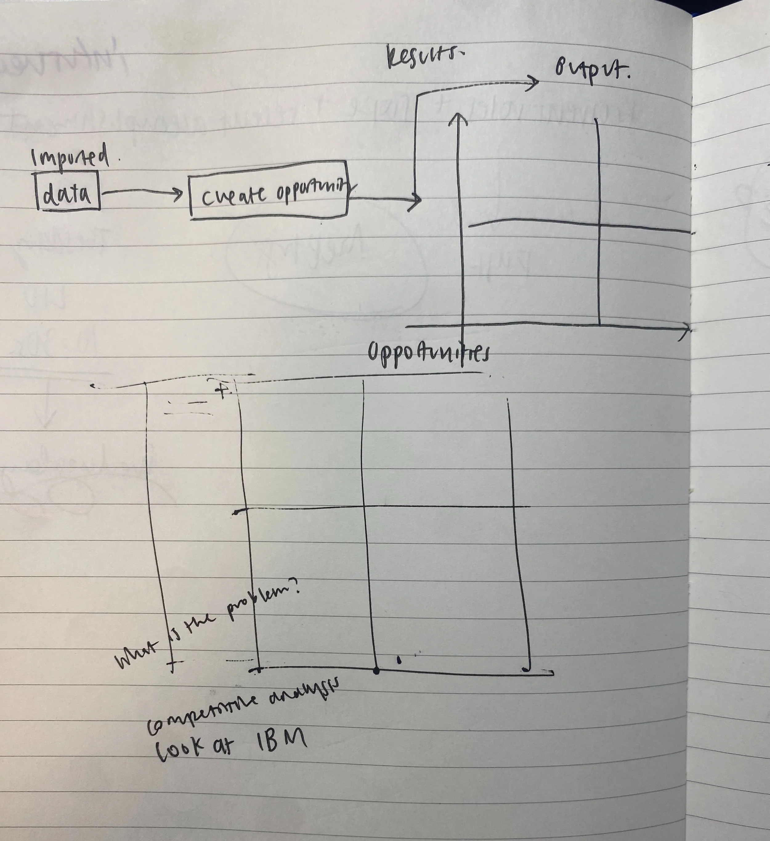
Understanding how business owners and current AI tools approach marketing analysis, I identified the need for a simple framework to guide decision-making.
My Initial Draft:
I designed a classic quadrant model, with value on one axis and confidence on the other, reflecting the thought process of a business owner analyzing marketing opportunities.
Feedback from My Mentor:
"Proceed!"
Breaking down the user flow
Based on the tech the engineering team provided, I mapped out the user flow.
Clarified the essential steps for accessing opportunities, focusing on two key screens due to time constraints:
Homepage: Displays all opportunities clearly.
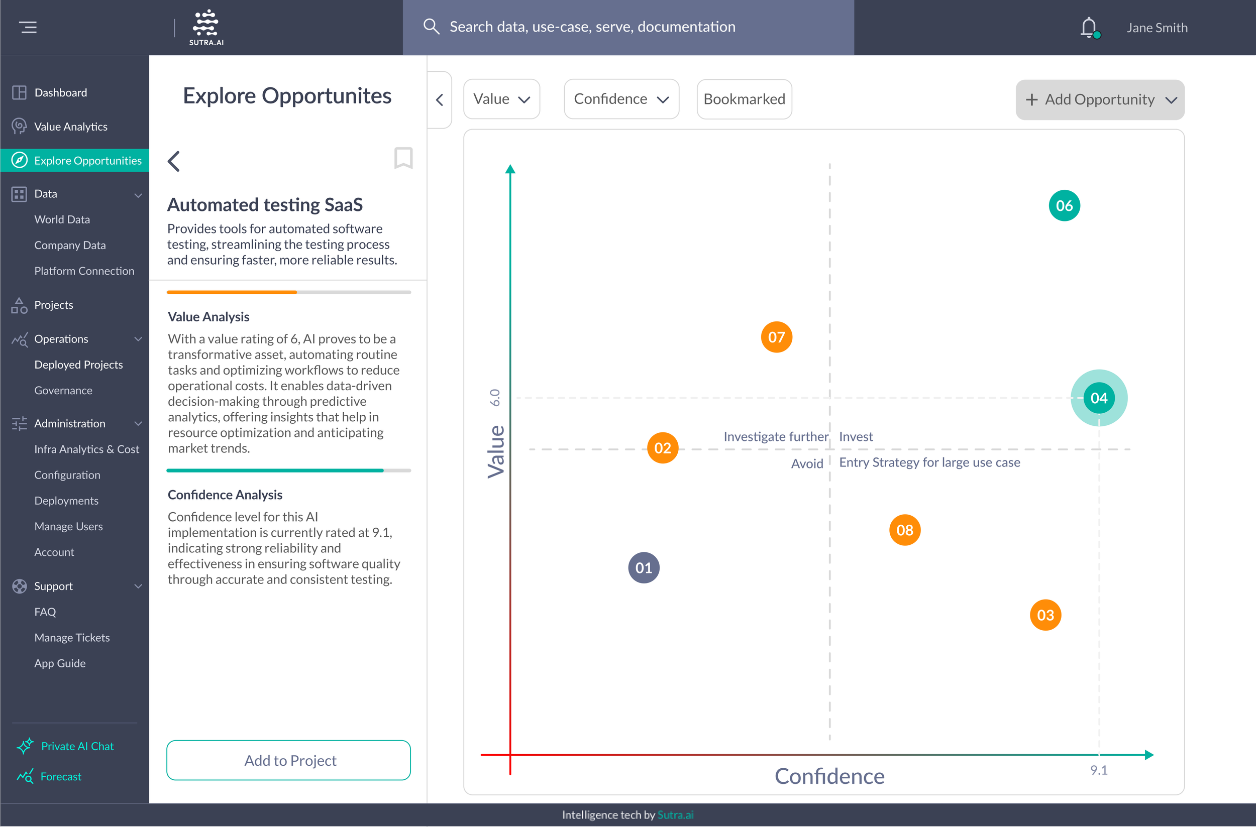
Opportunity Detail Screen: Provides in-depth insights with value and confidence levels.
This streamlined approach ensured an efficient design within the project timeline
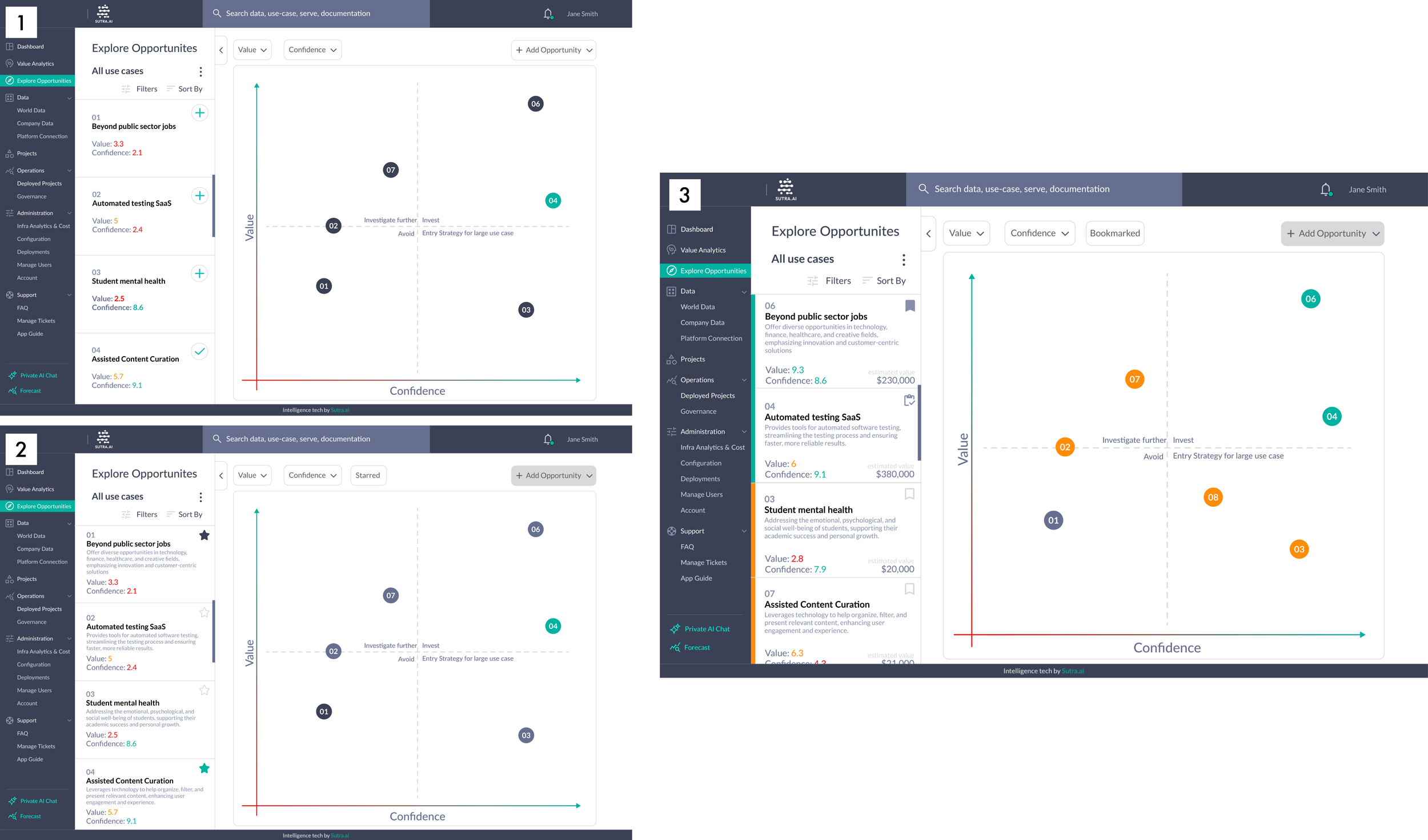
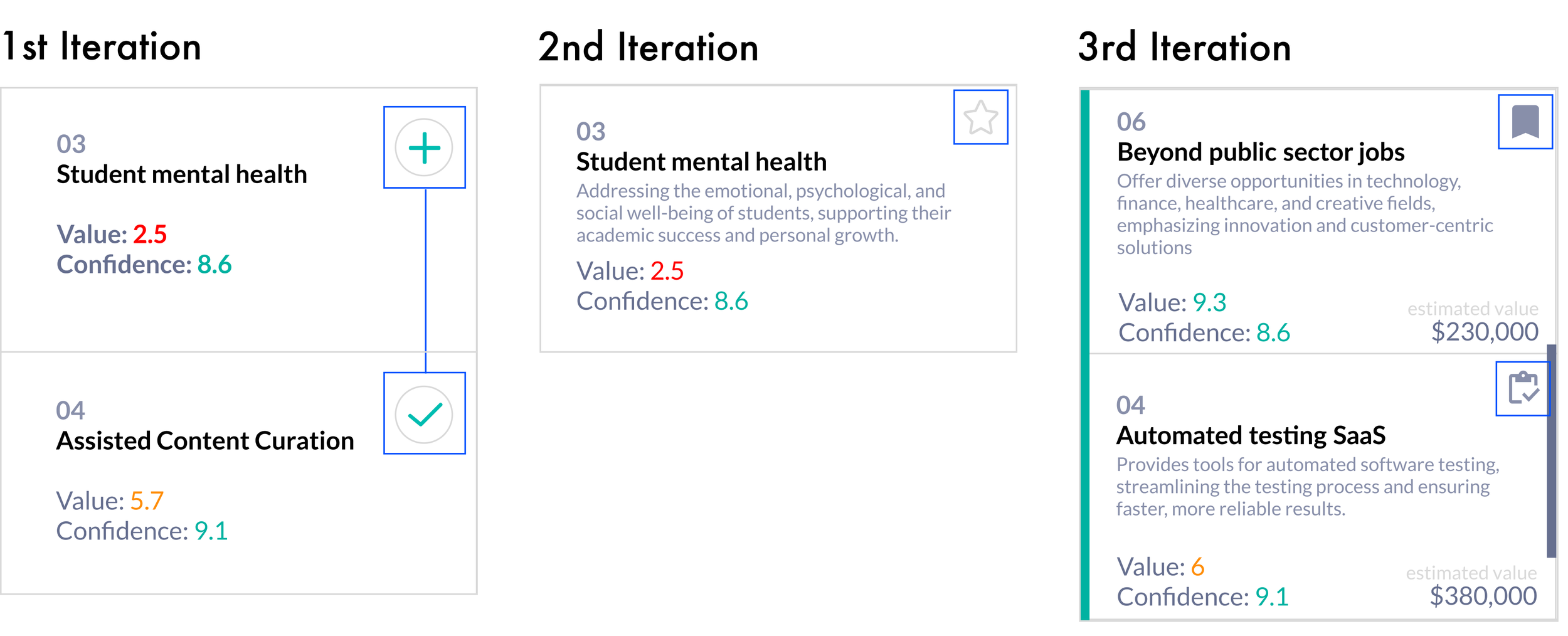
Homepage Iterations
What’s on the homepage:
Potential opportunities
Users can save opportunities
An opportunity diagram
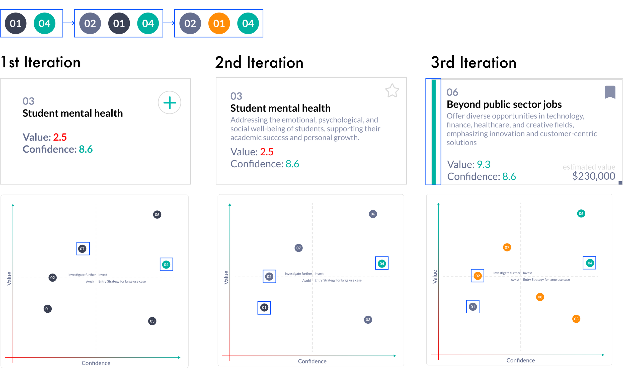
Iterations Overview:
Giving more context to users
Using colors more strategically
Showing clear status change
I Skipped low-fidelity wireframes
due to limited time and the availability of an established design style, allowing me to focus directly on high-fidelity iterations to deliver a polished and functional design within the project constraints.
Using colors strategically
Creating a visual hierarchy for quick decision-making, improved differentiation, and emotional cues
Assumption: Red was excluded because opportunities can change dynamically when users add new data sets, and red might imply permanent rejection or negativity.
Green Bar on Cards: Added to make high-priority opportunities easily identifiable at a glance, eliminating the need to read specific numbers.C
Better differentiability: Initial colors (black, grey, orange) had low differentiation, leading to confusion. So I Refined the color scheme to grey, orange, and green for clearer distinctions and improved usability.
Giving more context to users
Provide immediate context and allow fast decision-making.
Added estimated value: Showing the estimated value to help users assess the potential financial impact
Added descriptions: Short descriptions provide quick context
Status change
Provide users with clear feedback about their actions and the current state of their opportunities, reducing confusion
-
Users could add opportunities, but it wasn’t clear where the information was saved or its status.
-
The star icon showed users liked an opportunity, adding an emotional connection.
However, it didn’t address status changes like deployed opportunities.
-
Added one statuses: Deployed (opportunities in action)
Included all opportunities, including future ones, for a full overview.
These changes clarified actions and visually distinguished stages of interaction.
Final Prototype
Scenario:
You’re a business owner looking for ways to improve your business.
And you check out the explore opportunity function.
On the homepage, you will find
Potential opportunities, are ranked by value (how much impact the opportunity is predicted to have) and confidence (how reliable the prediction is).
Color-coded opportunities: grey, orange, and green, with green indicating the best options.
Bookmark opportunities to review later, similar to adding items to a shopping cart.
This setup helps you prioritize, plan, and track your business improvements with ease.
Clicking on an opportunity,
You’ll see detailed information.
From there, you can either add it to a project for deployment or bookmark it to compare it with other opportunities later.
Reflection
What I learned
Take initiative and ask for projects you want to work on. I was working on onboarding projects and I expressed that I have a deep interest in the AI space so the CEO gave me this project.
I like working with a team of designers.
Consider your audience when explaining your design decisions.
Ask for feedback! My mentor gave me so much insight into designing dashboards that informed my designs.
What I would do differently if I had more time
Testing. The design was informed by previous research but I wanted to test my designs with updated research and stakeholders that we might have.
Learn more about the back end of AI.


